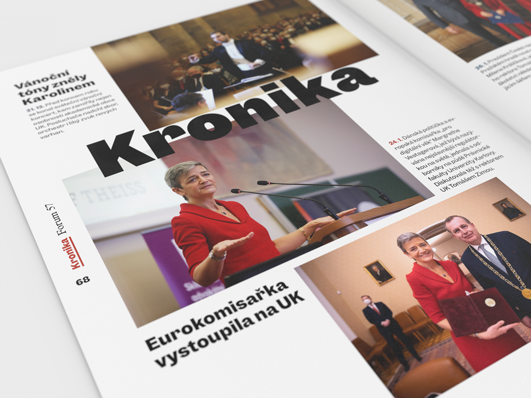
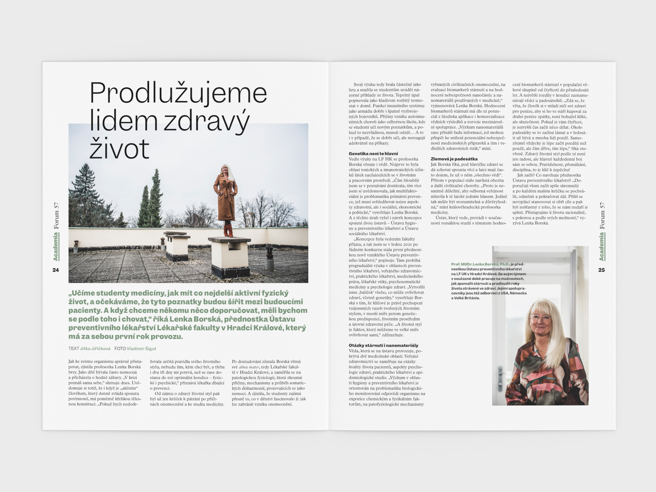
Forum Magazine 57
Together with the new rector of the university, the time has come for minor changes to the university magazine. They were also reflected in the design. We changed the titles, color palette, cover page and other details.
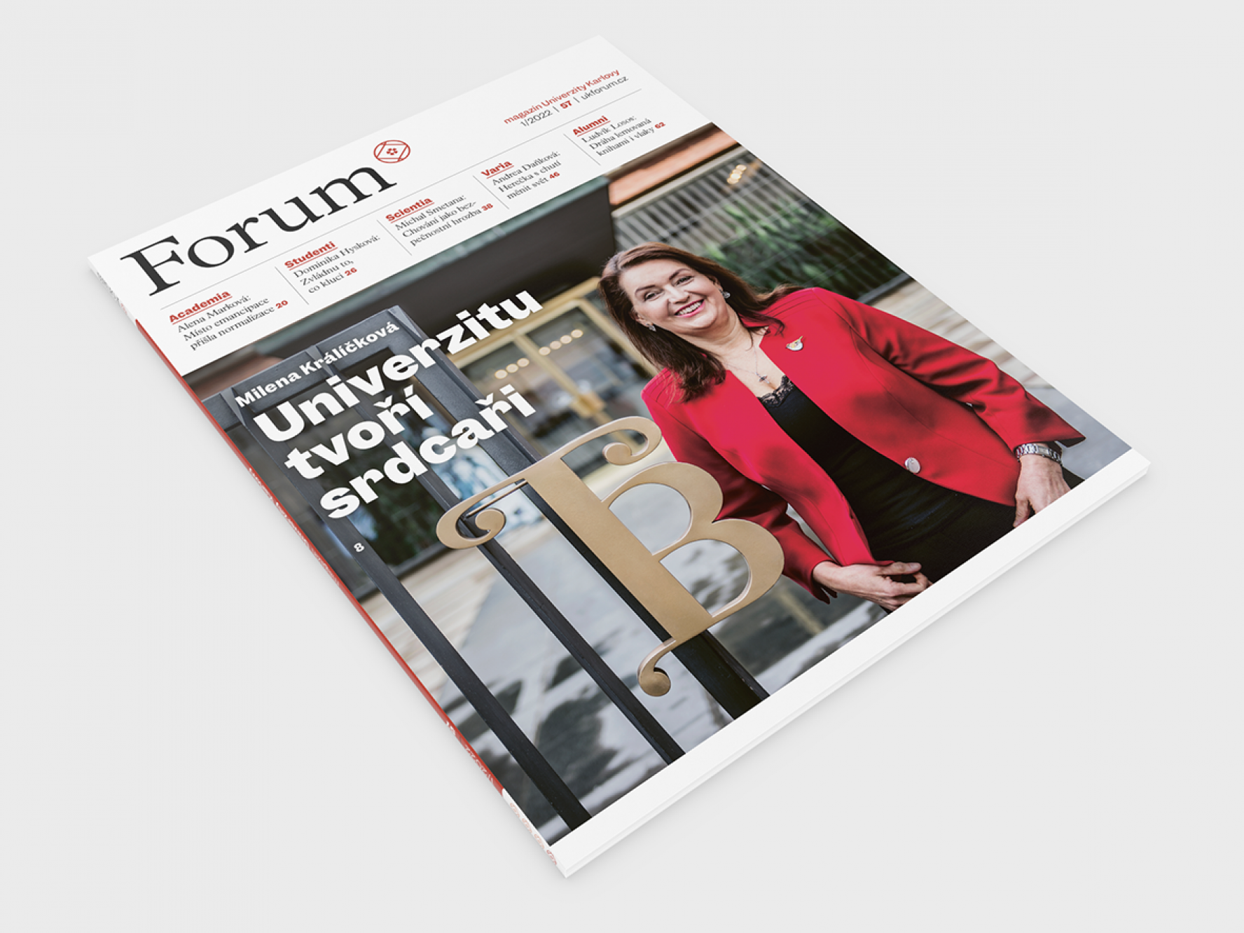
We moved the trailers for the content of the issue from the bottom of the magazine up to the title
We‘ve been using the Garnett🔗 font in the magazine for some time, and now we‘ve given it space in the headlines
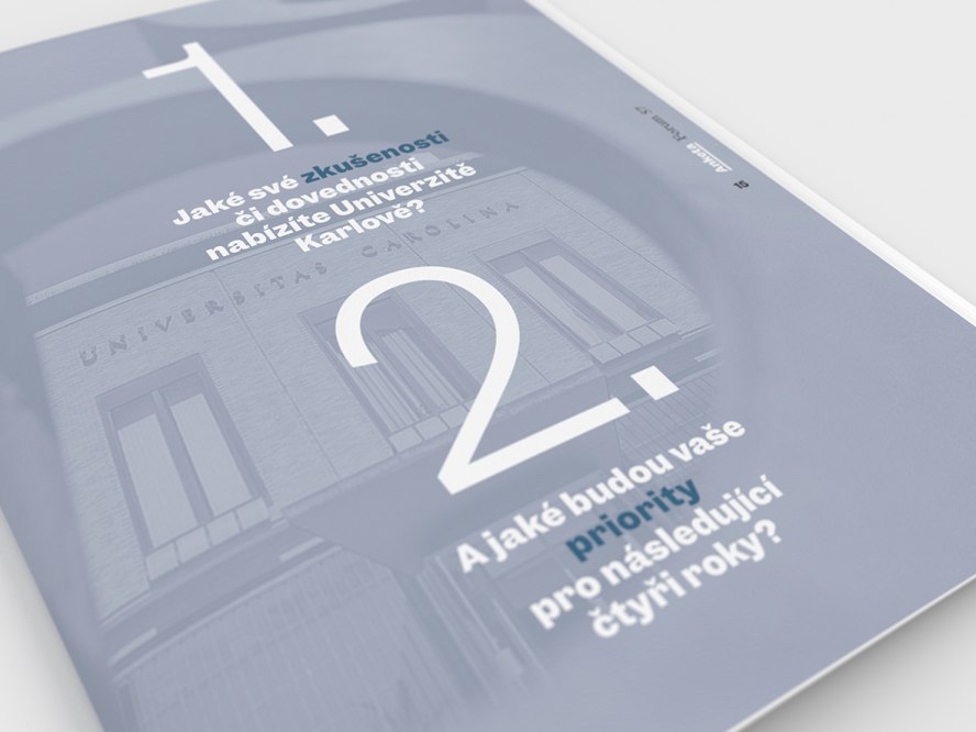
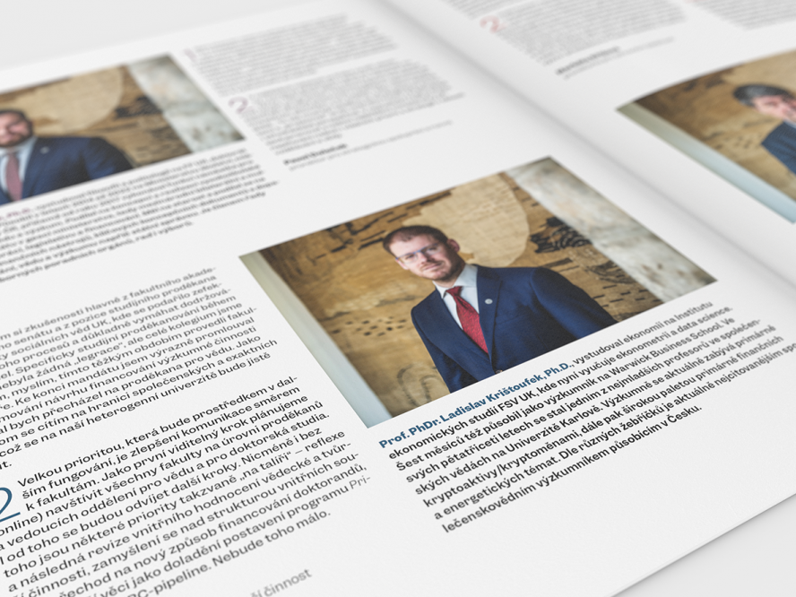
Typography still relies on a functional combination of Plantin and Garnett
The new color palette is a bit more muted. We use twelve basic colors and their shades
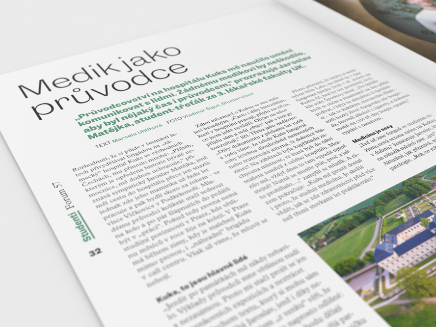
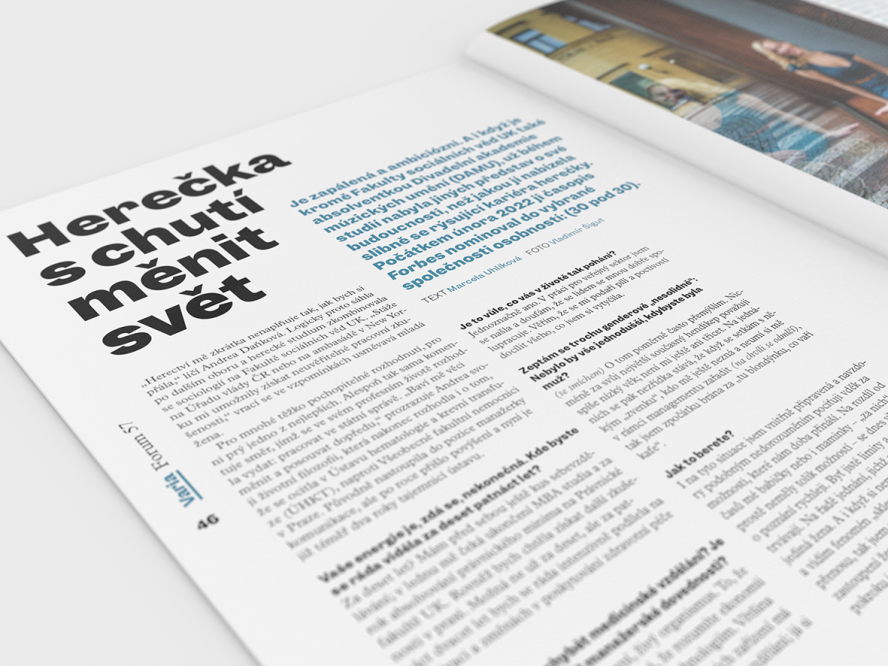
We alternate thin and bold cuts in the headings
The image material continues to be created in collaboration with professional photographers
